Shades of white and layered neutrals create amazing spaces when properly done. This trend was hot! last year and will continue into 2012. However, pops of color are entering the scene in a very charismatic way. Think white canvas with splashes of beautiful, vibrant color. In contrast to these neutral backdrops, full-on color is crowding its way into the design trend as well. All images are from Traditional Home.
The white walls and sofa allow the pink to take center stage beautifully.
 I love yellow in small doses like this.
 These purple walls are stunning paired with intense orange. The designer has balanced out the saturated color with achromatic brown so that the eye can rest-which is very important.
 Gold and brown, great combination and looks gorgeous with feminine pinks.
 Again, this works because the balance is right. There is terrific contrast and a bold achromatic rest (black fireplace).
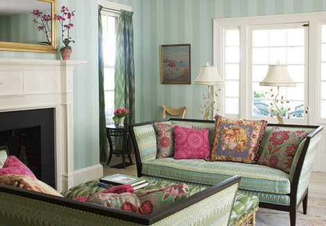 Soothing hues but not putting anyone to sleep! This is happy and fun but balanced so well- keeps it very sophisticated.
 Color of the year here on the drapery. The keys to the success of these spaces are balance of contrast and achromatic color. In this beautiful room, the white walls and floors offer terrific contrast to the bright hues. the brown sofa adds achromatic balance.
 Now that you are starting to see this color everywhere, how do you feel about it?
je


